

Sunday 30 October 2011
Sunday 23 October 2011
Levi's Window Display
From afar a really basic and simple window display but little touches like creating a 'wall' out of tape measures set it apart. Tieing it in they also do free alterations on Levi's jeans - happy days for all the fellow short people out there. 

Monday 5 September 2011
QR Codes
Quick response (QR) codes have taken information at your fingertips to a whole new level. Smartphones have revolutionised the way we live and function - we can get hold of anything at the touch of a button. Sometimes I wonder what I would do without my blackberry, all be it a broken one and therefore have not had the chance to fully explore these QR Codes. As a concept I think they are fascinating, they seem to be on everything. I saw one on an events calendar, they crop up on walls, labels and the most recent - the job section in Marketing Magazine. A great place to see it used especially as most jobs are applied for online and it stands out from all the other wordy job ads and generates intrigue about the position and leads to potential further traffic on the site.
 However now it's not just about what the code leads to but what you can do with the visual of the code to add further impact. As long as you keep certain elements unchanged the code should work, hence the range of designs below. It's pretty fascinating what you can do, I particularly like the Wired and Time QR codes, think they look amazing and very in keeping with their branding.


Tagged.
Everything nowadays has a tag or a label, so basically you can't escape from anything, where your going, who you were with, however sometimes it can work in your favour. Obviously great from a night out when your friend has the camera or you've been to an event, say like the white party...
In the O2 arena there was a Smirnoff team milling around, their aim - get anyone with a facebook profile to log in on their tablets and you get a band. This band was scanned and links to you.
 So the people who were initially getting you to log into Facebook are at the event for the whole evening, their second aim - taking photos of you at the event. Once photographed they scan the band, Smirnoff uploads the photo's and you are automatically tagged.
I thought this was a great marketing ploy, Smirnoff get photographs and peoples profiles are updated without them having to lift a finger. The only downfall was the image quality which is more of a technical spec however disappointing to see a bit of a blurred image the next day.
Facebook has become this immense hub of not only social activity but is now a huge online presence for brands. Companies not only have their own pages that you can 'Like' but they use it for competitions and regular updates. Facebook literally has the world eating out of its hands, if you don't have a friends number you can always get them on Facebook in as quick time.
The other small detail which was a great novelty was the Smirnoff lights... Guys walked out with huge glowing tubs of these little rings - glowsticks are so last year. Rubber ring loops (one size fits all), on and off switches and a crowd full of people all dressed to the white theme with white lights adorned on their hands. It looked amazing.
So the people who were initially getting you to log into Facebook are at the event for the whole evening, their second aim - taking photos of you at the event. Once photographed they scan the band, Smirnoff uploads the photo's and you are automatically tagged.
I thought this was a great marketing ploy, Smirnoff get photographs and peoples profiles are updated without them having to lift a finger. The only downfall was the image quality which is more of a technical spec however disappointing to see a bit of a blurred image the next day.
Facebook has become this immense hub of not only social activity but is now a huge online presence for brands. Companies not only have their own pages that you can 'Like' but they use it for competitions and regular updates. Facebook literally has the world eating out of its hands, if you don't have a friends number you can always get them on Facebook in as quick time.
The other small detail which was a great novelty was the Smirnoff lights... Guys walked out with huge glowing tubs of these little rings - glowsticks are so last year. Rubber ring loops (one size fits all), on and off switches and a crowd full of people all dressed to the white theme with white lights adorned on their hands. It looked amazing.


Friday 19 August 2011
Nice firm buttocks!
No, we are not talking about Spike from Notting Hill. Last weekend I ventured to London for a huge white party hosted by Smirnoff at the O2, by huge I mean 10-12,000 people from all over Europe with a strict dress code of white only.
Anyway getting side tracked already, we stayed in a quaint little Radisson hotel on Canary Wharf... a stones throw from the party location. In our room I was fascinated by a piece of metal work, framed using a recess in the wall. The photo really shows the definition clearer than you could see when looking at the piece in person.

It wasn't until we put the room lights on later on that it became clearer.

I thought this was a great piece and could work really well in a high end fashion retail space, very different and great how the definition was then reflected on the wall through the shadow. Impressive use of art, positioning and lighting. Food for thought.
Wednesday 10 August 2011
Jelly!
We all know jelly is fun, it is a classic kids party pudding and even the adults have a soft spot for it. It is a fascinating thing, neither liquid or solid but fun too wibble and wobble seeing how far you can push it before it topples over.
However we are not talking your average jelly here, Bompas Parr have definitely taken it to new levels...

As you can see it is pretty epic, not only do they have more than your average jelly mould but the different colours and shades not to mention ones in the form of the 'Gherkin' and below - Buckingham palace.

Its not all about the jelly, they also do Kitchenalia - you've guessed it things for your kitchen but a large part of what they are about is the events and shows they hold. Whether it is a party or corporate event they can tailor it to your needs and put on a party to remember. For instance just look at this - neon jelly!

An amazing company and looking at their many projects from Dining with Alice to the Dirt Banquet you wonder whatever will be next.
Have a good look around, truly fascinating and magical - www.
Monday 20 June 2011
'The' torch
Were not talking you average mag-lite here, this is the one and only 2012 Olympic torch. I have to say it is probably the first thing I have generally been impressed with in regards to the games. Don't get me wrong, I applied and was successful in gaining four tickets, what for you ask, good question, I think we would all like to know but that is a story for another time. Being a bit of a sports fanatic I am quite excited that our country is holding the games but it probably couldn't of come at a worse time what with the recession, yes it is creating jobs now but what happens once the games have been and gone...
Anyway, natter natter natter. So, this beautiful torch, whether it looks as good in person in comparison to this photograph we will never know but on that black background it looks truly amazing standing all alone, tall and proud. The torches perforated body has 8,000 holes which represent the 8,000 bearers that will carry the torch on it's journey. The bearers will be a mixture of athletes and people who have given outstanding sporting contributions to their community. I am excited to see if Barber Osgerby have anymore involvement in the Olympics. Take at look at their website for some design inspiration.
http://www.barberosgerby.com/

Sunday 19 June 2011
A Glass and a Half Full Productions
Cadburys is up to it's usual tricks... Creating adverts about anything, because they can. There is no new message or product it is trying to entice us with, it is for pure entertainment. If you think back there has been the drumming gorilla, kids eyebrows and the vehicles on the airstrip. This is no different in the sense of there is no logic. However I was interested to see what they had come up with when I first viewed the ad on television and lets be honest, it's pretty random. It takes the notions of Toy Story, bringing things to life when no-one is around and uses the concept in a vintage shop. Yet again they had chosen a great song which was helping to sway me but the thing that tipped me was when I found out that it was not CGI but dancing people in huge items of clothing. Not only was it the clothes but the whole set was super-sized, the idea of this and a larger than life set fascinated me more than the final output itself. At around one minute into the advert you get a glimpse of some legs underneath a dress, but this clip is not used in the commercial that was aired on television.


Special thanks to Metro for the behind the scenes gossip.
Saturday 18 June 2011
3M
3M pretty much have their finger in every pudding that is going. A familiar one is the Post-it note found on any desk, everywhere. The most recent product to grace us is the 'Noise Cancelling Headphones' - I"ll be honest, I'm more excited by the new campaign than the headphones themselves. A number of times I have been told by tutors and designers among others, as well as seeing examples myself that the best ideas are always the simplest - this is no exception. A simple idea, beautifully executed equates to a fantastic visual and in this instance one that people can relate to on varying levels.


Personally the best visual for me is New York, it probably has some of the most iconic statues and buildings in the world, on top of that I heart NY. I am glad it has the location in the corner as I thought Shanghai was potentially Toronto and could of just about worked out Moscow. Either way this can be easily applied to most places, Sydney, Paris, Milan... the choice is endless. Like with New York the greater the difference in buildings and monuments the better the equalizer.
With the advert I am not so sure, it takes all the elements from above, adds in some new cities, but it is just the annoying noises which I understand is the point and probably why the advert is no longer than a minute. I personally would of preferred it if they could have used this and ended with the a song. Think back to the first iPod adverts, a silhouetted person dancing around to their iPod with a great song on. I think it is the one thing it lacks and it could of gave the 3M a more powerful ending, it could of even been a chill-out song to emphasis the point that there is no disturbance to your serene setting.
Monday 6 June 2011
Harvey Nichols
Harvey Nichols is not only fabulously expensive but possibly has 'the' best window displays. Working in their Visual Merchandising department would be a blast. There are no boundaries which is one of the great things about the company, I think this is partly because they are an upmarket (dare i say it) department store so to speak, housing a number of high end brands and a deli with some of their own pieces. With only seven stores in the whole of the UK your lucky if your city has one. I was lucky enough to be a student in Leeds, for me Harvey Nichols was very much a kid in the sweet shop scenario - you can look but don't touch. Harvery Nichols provides a platform for how shopping should be in my eyes, calm, clothes displayed so you can actually see them and don't have to wade through to see what the item is let alone the size or price.
After moving away from Leeds I have missed the city and every time I re-visit, like on this fine sunny day I get to see what I'm missing, how the city has changed and yet is still very much the same. While working around the city I visited a few of the favourites, Aladdins Cave being one, a vintage jewellery shop in one of the arcades and Retro Boutique based in Hyde Park where I used to live with the girls in our 'dolls house'.
But the point I am getting to is Harvey Nichols window display, have a peek -


The first image is what looks like a Ferrari made from little horses, like you used to have the army figurines when you were a child, also seen in Toy Story. But the whole car is made from them, there is no relation per se, except that you may need a car like that to be able to afford half of the things in that store.
Pencils. The second window, minus the mannequins and props is made purely from pencils. That is immense work, imagine being briefed for that! But how amazing, and it seems that the fashion comes second, it grabs your attention and it is fascinating what you can create with a few pencils, using the lead, rubber and body - crazy. Even though you may not be able to afford to shop there, they certainly want you to window shop and it ingrains the brand to you and is something you are likely to share with others equating great viral marketing too.
As we all know Google is the dominant search engine, Google has also entered my vocabulary as an everyday word, according to myself and many others you don't search it, you Google it. I love Google. I have noted my love for the search engine on a previous post looking at bing among other sites and the simplicity of Google. The funny thing is they don't do any advertising they just seem to have become superior. Google logs around two billion searches a day, and from each pay per click ad make just a few pence, but with two billion searches and a few pence each time... you do the math.
One of the other things I like about Google is how they mark birthdays, anniversaries, significant days in the calendar and it is simply incorporated into their homepage.


If we look at the two examples they are in celebration of Roger Hargreaves 76th birthday, we will know him better for his collection of Mr Men drawings and stories. It's a simple touch that gives Google a fun side and we learn some useless facts that one day will come up as a question on a pub quiz. The themed Google title provides not only a new visual but a direct search to further information on the topic being celebrated. Using these as themes it allows Google to have fun with it's own name while having a brief to work to as well as being informative. Happy Googling folks.
Sunday 5 June 2011
I am...
Mee. Nikon, like T-Mobile are using communication as a focal point. Nikon have focused on the moments we get to capture and save as a visual reference. The clip I love the most is the one of Robbie Williams getting everyone to take the photograph, all those flashes - immense. What an ideal moment to capture, such an event.
Looking at the range of adverts and the variation of content it shows all different moments you can capture on film from weddings to playing in the park or capturing your pets do silly things. Similar to T-Mobile in essence is the sharing element that we can do with photographs either by printing out or email, social networking etc.
With photography it is all about capturing those moments on film, basically taking a moment in time and freezing it. With digital photography it now means we can take a zillion photo's to make sure we get the 'perfect' shot, sometimes I wonder if it is so perfect, maybe more staged. We have also lost the excitement of waiting to get your photos developed and see the results, now we want to see the photo in an instance because we can, we are very much a society in need of knowing the information then and there, hence the development in smartphones. A minor tangent nonetheless happy snapping folks.
Sunday 22 May 2011
BBC Radio 6
Hey folks, it has been a while, lets just say I have been busy, May, has been busy. With everything else going on the blogging has fell by the side, so here we are - time to update and cross a few pieces off of the list.
When I first saw this advert it made me smile, using the different DJ's featured on the radio station, all making there own way to the 'hub' of speakers. Simple way of showing the selection of DJ's and the range of music played on the station. To be fair any song advert that has 'You've Got the Love' has my vote - amazing song. The other thing i particularly like about the trailer is that it is short and snappy which you could argue is because it is only used on the BBC channels but they give you all the information needed without dragging the advert out. Since the advert I have started to listen to BBC 6 which before this I never knew existed - the plan worked.
When I first saw this advert it made me smile, using the different DJ's featured on the radio station, all making there own way to the 'hub' of speakers. Simple way of showing the selection of DJ's and the range of music played on the station. To be fair any song advert that has 'You've Got the Love' has my vote - amazing song. The other thing i particularly like about the trailer is that it is short and snappy which you could argue is because it is only used on the BBC channels but they give you all the information needed without dragging the advert out. Since the advert I have started to listen to BBC 6 which before this I never knew existed - the plan worked.
Tuesday 12 April 2011
Junk(tion)
These creations are a far cry from junk, personally I think they are pretty innovative pieces of furniture. It's the kind of quirky thing that you would like in your house as a focal point and it's practical for once. The project is all about taking objects that have been classed as junk by anyone and everyone and reinventing them either by adding other things to them or taking bits away and teaming them with others. Using the vision that 'we already have to much in the world' brings a new perspective to every piece of furniture that we class as junk rubbish or trash. We already know one persons rubbish is another persons treasure. You can look at the general idea and see how it has developed over the years from car boots to eBay to Gumtree to antique and vintage shops popping up everywhere. Below are some of my favourites I selected from the site, simple ideas that could be re-created in your own home. I particularly like the table football hangers and the bike stool. That bike stool would be fabulous in a little cafe/bar, at home next to your telephone table or a novel piece for a bike store - fantastic.


Sunday 10 April 2011

Tuesday 5 April 2011
Rob Ryan (not Brydon)
Rob Ryan's style of work could be called child's play by some; others will see it for the creative art it is. I have always been fascinated by this style of work. The intricate shapes formed and wonder how many hours it would take to cut out the leaves on the tree. It's slightly different now, as you can use laser cutters and screen printing to help get the accuracy and volume produce prints for resale. One of the exciting things about this method is that you are always discovering something the more you look at the pieces - bit like those magic eye posters although I could never see anything in those. Most of the work consists of birds, trees and houses - a sweeping generalisation indeed but common features nonetheless with a hint of chintz, modern chintz. It is also amazing how the work is created from one piece of paper, all words and images entwined, linking with each other in new ways that before may never have happened if another method had been used. Ryan has done a mixture of work styles, some of it deep and profound, others mere thoughts that may have occurred during a walk or maybe while eating breakfast. Clients include the likes of Vogue, The Independent and Fenchurch among others.


The Fenchurch pieces I particularly like. Firstly, you wouldn't naturally associate this style of work with the Fenchurch brand but I like how the logo has been used in two totally different ways, one being the new 'building' in the big city and second is subtly Fenchurch's own pearly gates. An intriguing method both in creative style and the final outputs, a crowded space but nothing is cluttered.


The Fenchurch pieces I particularly like. Firstly, you wouldn't naturally associate this style of work with the Fenchurch brand but I like how the logo has been used in two totally different ways, one being the new 'building' in the big city and second is subtly Fenchurch's own pearly gates. An intriguing method both in creative style and the final outputs, a crowded space but nothing is cluttered.


Saturday 2 April 2011
Scent Marketing
This is not an area that I have really given much thought to before but it is subtly around us all. Scent marketing might not be everywhere as we know it but smell is a huge sense for all of us, usually because of memory association. For example smelling perfume can make you think of that special someone or freshly cut grass means Hay Fever... I mean Spring. One particular night I remember cleaning with Dettol which I had obviously not used for some time and I was taken back to our 'dolls house' (student digs) in Leeds in an instance. Scent can help set the scene without the scene being there. This all came about while watching a snippet of the One Show and they were saying about spraying bikini's with sun tan lotion for that holiday feeling, barbecue tones spritzed on summer invitations to get you in the mood for those hot dogs and toasting of marshmallows... Hence why girls spray perfume on the love letters they write, embodying themselves and transporting someone to that place.
Peace Love & Storage
Having a bit of a lazy Saturday morning before the weekends antics all kick off and while watching a bit of Gok on E4 this advert was shown -
I thought it was going to be a promotion for Mock the Week or a comedy battle of the sexes but in fact it was Ikea. I found this quite funny because as they were delivering the puns I was looking at all the furniture thinking most of it was from Swedeland. A clever little advert that gets you looking at the furniture while enjoying the content, one of the best bits is that both sides of the argument ring true, minus the one about her drawers.
I thought it was going to be a promotion for Mock the Week or a comedy battle of the sexes but in fact it was Ikea. I found this quite funny because as they were delivering the puns I was looking at all the furniture thinking most of it was from Swedeland. A clever little advert that gets you looking at the furniture while enjoying the content, one of the best bits is that both sides of the argument ring true, minus the one about her drawers.
Wednesday 30 March 2011
Herb Lubalin
The latest Creative Review is a logo special, some of the winners are expected, Nike, Apple for instance but one of the logos that stood out the most is the Mother & Child logo designed back in 1965 by Herb Lubalin. This was originally designed for a magazine which never got published which is such a shame. The logo is pretty self explanatory, its simple and cleverly uses the type to create an image.

A couple of other designs by Lubalin follow a similar theme of being family orientated; again simplicity rules for maximum impact.


A couple of other designs by Lubalin follow a similar theme of being family orientated; again simplicity rules for maximum impact.

Tuesday 29 March 2011
Perfection?
If you are involved in design in any way shape or form you will analyse and judge everything you see, it's natural. Would you have used that layout, chosen a different colour or expressed your message with that typeface? Today I treated Percy (my car) to a Mini Valet in a nearby village and while the staff washed away I was looking at there handmade signs informing of prices and services. There is something quite satisfying about seeing a homemade sign. It has not been scrutinised from every angle, looking at the leading, alignment and positioning. It is more than likely that they looked at what materials they had, who had the most legible writing and what tins of paint they had knocking around. The funniest thing is that we could spend hours trying to create a look as simple as this. It did make me a smile that you could see rubbed out ruler lines used to help make the copy look as neat as possible given the tools available.

* Two other things, firstly the Mini Valet at £10 is amazing, my car looks brand new. Secondly why does it always happen to rain when I have finally got round to washing the car?

* Two other things, firstly the Mini Valet at £10 is amazing, my car looks brand new. Secondly why does it always happen to rain when I have finally got round to washing the car?
A little mistake...
It always seems to be the simplest of things that you never pick up on. I am currently working on some clothing packaging at work. I popped into the warehouse to cross reference a few other product lines and spotted a little mistake which actually could be classed as quite a big mistake. On the reverse of the clear plastic packaging is the mandatory warning notice about being in reach of babies and children with potential suffocation issues. The major error comes with the spelling of children, an O is in the place of a C, bearing in mind this is on the reverse of a range of packaging that is potentially distributed worldwide. The thing that baffles me is that the O is nowhere near the C on the keyboard, printer error maybe...

I can confidently say there is no Ohildren in my work. This has shown me how important checks and proofs are to making sure the final piece is immaculate.

I can confidently say there is no Ohildren in my work. This has shown me how important checks and proofs are to making sure the final piece is immaculate.
Monday 28 March 2011
Keanah - Ted Baker

The said shoes in question from the previous post are the Keanah peep toe stiletto, divine indeed! On the shelf - a little more than your average shoe; with some legs attached to them - amazing, elegant! The shoes with the dress, beautiful, they are light on the eye with thin heels, gold inners/soles and ornate bows. I love the bow, it is like something you would find on a present and its not a run of the mill bow that you find in the majority of high street stores. The other thing about these shoes is the packaging, it has the usual tissue and box but in each bow loop is a polystyrene cylinder to keep the bows perfect form during transportation and storage - genius.

Sunday 27 March 2011
Teddy Baker
In the middle of a crazy busy weekend, I popped over to Birmingham for a cheeky shop, second stop Ted Baker. A friend of mine was on the dress hunt for an awards dinner. I have to say I love Ted Baker. Firstly great clothes, and the shop design is a mix of old and new - fabulous wooden floors, some old style lamp shades that had been revamped to bring them more up to date, hung at different levels and used as a corner piece. They have used a combination of metal and wood. I particularly liked some of the clothing rails and the stair rail which reminded me of the style of what my mum would call old hospital beds; almost a bit drain pipe-esque but thinner, not too chunky or weak but blends well in the setting. The other thing that I really like is how they showcase their pieces which is obviously part and parcel of being a high end high street retailer. Each rack is a different design to the next and features a few pieces so you can actually look at the clothing and not get bombarded by a mass of material clumped together. After a scout around a few bits, we were taken to the changing room and our clothes carried for us (why thank you kind sales assistant). They have large changing rooms but more importantly they have a wide corridor between the rooms, creating an in-house catwalk with a huge mirror at one end so you can have a good look at yourself. One thing which I thought was truly amazing is that when my friend was teetering around on her toes pretending she was in her heels the upstairs sales assistant offered her some shoes to help finish off the look. I thought this was great, firstly it helps you get a good look at the dress and how you will potentially look but it also draws your attention to some fabulous shoes they were selling which before we had merely glanced at and were now falling in love with. A great way to subtly make an extra sale without hassling the customer but merely providing a service.


Tuesday 22 March 2011
Diet Coke
I have only seen this advert once and I quite like it but at the same time I feel there is something missing. It reminded me a bit of the innocent smoothie ad although technically this concept was more relevant to diet coke being the 'lighter' option, hence the puppets. Again good song choice, I think the issue I have is that a pile of work is an easy task to fix - you invest time to reduce it, maybe it should be something a bit more challenging that makes you laugh a bit more.
One of the funniest things is that I was flicking through an old Marketing Week magazine and I read an article by Steve Hastings about Innocent's cheeky smoothie ad. At the end of the article he said that Coca Cola would never make an ad like this and that it couldn't joke and have all the good tunes. Bizarrely,a day or so after reading that article I saw the coke advert, did he know something we didn't? I think Coca Cola have used a pretty good tune but if were being honest nothing will ever beat the original diet coke break commercial with the Etta James 'I just wanna make love to you' tune and the hunk drinking from the can.
One of the funniest things is that I was flicking through an old Marketing Week magazine and I read an article by Steve Hastings about Innocent's cheeky smoothie ad. At the end of the article he said that Coca Cola would never make an ad like this and that it couldn't joke and have all the good tunes. Bizarrely,a day or so after reading that article I saw the coke advert, did he know something we didn't? I think Coca Cola have used a pretty good tune but if were being honest nothing will ever beat the original diet coke break commercial with the Etta James 'I just wanna make love to you' tune and the hunk drinking from the can.
Sunday 13 March 2011
Elle MacPherson Intimates
This is a bit old, it was made for the New York Fashion Week in 2007 but I have a feeling that things like this will be appearing in front of us even more. For example we have seen Adidas introduce the AdiVerse wall and with brands fighting for our attention your average shop front may not remain the same for weeks on end if it goes digital. One key element would be the potential to change what is on the screen daily from new garments to offers tailored to each store.
This is a great example of what fun you can have with technology and your prospective audience. You will always have a core audience but this display allows yo to interact with people that would possibly not be interested in your brand previous to this. This concept ties in greatly with Elle MacPherson Intimates as your are uncovering the lingerie, seeing beneath the clothes so to speak. Underneath you reveal models in said underwear, lounging around - a video on loop and depending which area you uncover depends what you see (bit like the old catchphrase...). An interesting factor is that there are still some people who seem quite oblivious to what their presence does to the screens, nevertheless an impressive development in technology that makes the field wide open for possibilities.
This is a great example of what fun you can have with technology and your prospective audience. You will always have a core audience but this display allows yo to interact with people that would possibly not be interested in your brand previous to this. This concept ties in greatly with Elle MacPherson Intimates as your are uncovering the lingerie, seeing beneath the clothes so to speak. Underneath you reveal models in said underwear, lounging around - a video on loop and depending which area you uncover depends what you see (bit like the old catchphrase...). An interesting factor is that there are still some people who seem quite oblivious to what their presence does to the screens, nevertheless an impressive development in technology that makes the field wide open for possibilities.
Saturday 12 March 2011
Dyson
Over recent years men have become more favorable to shopping, looking after their image an choosing wisely were they spend there money. I think this has partly come round because of David Beckham and how Victoria groomed him, it became fashionable to look after yourself. The other thing is men aren't so willing to shop for hours on end - scouring every rail for that ideal top, they also need it to match a level of functionality. Even so many brands still direct many of their adverts at women, segregating the men who you could argue technically have more money to spend, not as frivolous and usually earn more than their counterparts.
One brand that seems to have nailed this is Dyson. Typically you could say hoovers and washing machines, 'white goods' are aimed at women but Dyson sells its products on it's engineering credentials which have the appeal to the men. On top of this the design mixes hard lines with curves, deep steely greys and bright bold colours to soften the overall look and bring it to life. All of Dyson's adverts are about the product and the technology behind it making it gender neutral. My mum swears by her Miele but I have to say I would tempted to buy a Dyson if it was for me - the style, design and the brand. I also quite like the satisfaction of seeing what you have cleaned up, the transparent cylinders show off all the dirt. My brother moved out a year or so ago and he bought a Dyson for his pad. If I remember correctly it has fuschia coloured components but it doesn't matter. It's a Dyson and that is the model he wanted, he bought it for the technicals not the colours.
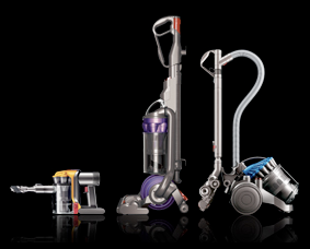
While we are discussing Dyson, they have continued to expand into similar areas of the market. In the hoover range it has developed into cordless hoovers and even made a hoover specifically for grooming your pets, you literally hoover your dog, get the loose hairs before they are all over your carpet and furniture. Ingenius.
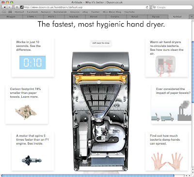
I particularly like the Dyson Airblade, also known as a hand dryer. You actually feel like your hands are being dryed and on top of this, when visiting the website, their Airblade page has got short sharp facts of which you can choose to delve into further. Take a peek, well setup and designed with consistency running through their marketing and advertising of their products.
As I ventured further into the world of Dyson. I found they also did fans, obviously not your average fan. This is Dyson were talking about.
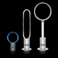
These fans look like they are out of Futurama - pretty space age. By far, one of the best features is the lack of blades for those little hands to get caught in, which in turn, makes it easier to clean, as it is just a hollow circle. Fascinating how this can generate a breeze when there seems to be nothing there! Obviously, it does come with the Dyson price tag - starting from £199.99 and rising.
As with everything it comes down to what your willing to pay and generally the more you pay, the better the quality. Dyson not only knows how to attract an audience, it can hold their attention. Definitely an exciting brand for the future.
One brand that seems to have nailed this is Dyson. Typically you could say hoovers and washing machines, 'white goods' are aimed at women but Dyson sells its products on it's engineering credentials which have the appeal to the men. On top of this the design mixes hard lines with curves, deep steely greys and bright bold colours to soften the overall look and bring it to life. All of Dyson's adverts are about the product and the technology behind it making it gender neutral. My mum swears by her Miele but I have to say I would tempted to buy a Dyson if it was for me - the style, design and the brand. I also quite like the satisfaction of seeing what you have cleaned up, the transparent cylinders show off all the dirt. My brother moved out a year or so ago and he bought a Dyson for his pad. If I remember correctly it has fuschia coloured components but it doesn't matter. It's a Dyson and that is the model he wanted, he bought it for the technicals not the colours.

While we are discussing Dyson, they have continued to expand into similar areas of the market. In the hoover range it has developed into cordless hoovers and even made a hoover specifically for grooming your pets, you literally hoover your dog, get the loose hairs before they are all over your carpet and furniture. Ingenius.
I particularly like the Dyson Airblade, also known as a hand dryer. You actually feel like your hands are being dryed and on top of this, when visiting the website, their Airblade page has got short sharp facts of which you can choose to delve into further. Take a peek, well setup and designed with consistency running through their marketing and advertising of their products.

As I ventured further into the world of Dyson. I found they also did fans, obviously not your average fan. This is Dyson were talking about.

These fans look like they are out of Futurama - pretty space age. By far, one of the best features is the lack of blades for those little hands to get caught in, which in turn, makes it easier to clean, as it is just a hollow circle. Fascinating how this can generate a breeze when there seems to be nothing there! Obviously, it does come with the Dyson price tag - starting from £199.99 and rising.
As with everything it comes down to what your willing to pay and generally the more you pay, the better the quality. Dyson not only knows how to attract an audience, it can hold their attention. Definitely an exciting brand for the future.
Subscribe to:
Posts (Atom)