Friday 24 August 2007

New York New York

After today my blog will not be moving for a few weeks this afternoon i fly out to the big apple and am touring round for a few weeks. All going to plan i will be visiting New York, Buffalo, some of Canada, Boston, Washington DC and back to NY.


See you soon with my own pictures of the Statue of Liberty!

Vertical Soccer

This is by TBWA in Japan. Furthering Adidas's 'Impossible is Nothing' campaign pushing the boundries of what can be done emphasising there slogan.


It would have been fantastic to see how people reacted around the area to it, as designers we look at it and appreciate it whereas most people probably thought they were half mad up there.

Thursday 23 August 2007

The one and only...


Quentin Blake! Blake's work is fantastic and he is renowned for his many illustrations for Roald Dahl's children's books (below illustration from the BFG). But now he is still drawing for books but has also turned his hand to cards, and i have bought a few myself. There is just something about the way he draws, it's amazingly accurate but the way he portrays the characters you get a good idea of there personality just in that one shot of them.


The website is also a joy to visit, at first you arrive and are disappointed at the lack of imagination, but then as you hover over a particular buttons drawings appear associated with that topic (see below).


It's an interesting site and show's more than just the infamous Roald Dahl illustrations. Looking around the site you get to see the various drawings cropping up everywhere making you smile and just to make the journey a little more fun.

http://www.quentinblake.com/

Harry Potter

I know its a predictable post but it's Harry Potter. At first i was reluctant to read Harry Potter, did not want to be a sheep following the crowd. Then a few of friends recommended it and my word is it amazing. The story lines that J K Rowling comes up with are fantastic, you get wrapped up in this magical partly envious as were are all muggles and just leading our so called normal life while all the witches and wizards are having fun. One of the parts i think is good is that us mere humans or muggles are involved in the storyline making it that bot more believable. I am about two thirds of may way thought the last book and it is gripping i never want to put it down because of the storyline and the way everything is described you get sucked into the world and feel as if you are going with them on there many quests.

It is a shame that the films aren't as good, but when are they, a book has so much more information in them and you make the settings up yourself which is the great thing about books because you get given a storyline but still you get to add your bits and its open to how the individual interprets it.

Eyes Wide Shut


At AS level i one of my choices was Film Studies, this means you see the good the bad and the ugly. To be fair it opened me up to a wide range of films that i would not usually watch, The Big Sleep and Brief Encounters both black and white films from the 40's that otherwise i would have never discovered. One of the wierdest films was Eyes Wide Shut, Stanley Kubrick is well known director and not your average. In my mind he goes on par with Tim Burton, nothing normal about there films. But one thing i did like about kubricks film is that there were consistent themes, if you have seen it or watch it look out for the constant use of red and the christmas lights they are just small things but you will notice alot reappear through the film and carry meaning with them. Also with this being Tom and Nicole in there first film together it works and helps with particular scenes because it's almost like alot f it is more than just acting.

Hairspray


The most recent adventure to the pictures ended up with none other than Hairspray...If you are after a good film do not go and see it, up for a cheesey light hearted musical then your fine. I was not sure what to expect but lets put it this way, i wanted to see Transformers or Bourne Ultimatum. The best bit of this film for me was John Travolta as a woman who every now and again seemed to sound like Dr Evil from Austin Powers - always funny and the husband played by Christopher Walken when Michelle Pfeiffer tries to seduce him and he just keep pulling out pranks from his joke shop. It's not the best film, pretty predictable but if you want to switch of for a few hours them here's your chance.

Miles Donovan


(above opening picture on his site). I came across the site through someone elses, Donovan's work is really interesting, mainly taking a spray paint base but then some taken further to print for various companies such as The Observer Music Monthly and New York Times. The majority of his work takes the same style but just varies in content and layout but by mixing it up and using new colours and content it keeps the style running and working.


It works for a magazine piece but cant say it would do much as an album cover. The next piece reminds me of computer games like Driver and Grand Theft Auto or gangster films based around New York from pictures such as the Brooklyn Bridge with what looks like yellow cabs.


Nice to see that there is some variation in his work style even if only small changes and sometimes do these montages can be quite hard to get the composition right but here it works and looks quite dark and sinister.

http://www.milesdonovan.co.uk/

David Shrigley

This guy really reminds me of Edward Monkton in his style but a bit more realistic and harsh. Simple drawings and silly little stories that many dont have much meaning behind and are just for amusement. See Below one of the excerpts from 'Blanket of Filth'.


With regards to his site I do not like the layout or the opening page, it seems totally opposite to all his work, there is nothing that entices you in to look at his work, but lucky for him some of the drawings and stories are quite funny if the people look.

http://www.davidshrigley.com/

Modern Toss

Modern Toss is one of the bizarrest and quite funniest things i have seen, i think one of the best clips is the first trailer for advertising it on channel four in the movie section. Interesting how they mix cartoons and real life settings to create there plays, wierd and funny all the same.


http://www.moderntoss.com/

Andrew Rae

I came across this guy from someone elses website personally a good find i would say. His work is pretty cool and its interesting because the more i look at various peoples work on the internet and in books the more i realise you dont have to be the amazing drawer, now Rae's work is good and accurate, but it shows you can have fun and do things your way and that you dont have to have all these perspectives and shadowing. Below is a snap shot from his website, pretty funky and easy to use, also interesting to see what people do with there sites to put there mark on them or make them that bit different from the usual dreamweaver templates.


The two pieces i chose of his work are quite busy alot going on but they create an overall picture, it's not till later on when you look at it in more detail that you realise there are lots of little bits going on, bit like 'Where's Wally' really.


This next piece is for The Raconteurs but it has replicated the album cover from Pink Floyd Relics (see two below) in the image of Pink Floyd's cover they dont look as similar but we have the vinyl cover in our houst at university as wall decorations.


Check out his work at http://www.andrewrae.org.uk/

Third Eye Design

This consultancy has bases in Glasgow, Loondon and New York. There site is very easy to navigate and soothing on the eyes, it's relaxing to view. When you look at there recent work i like how it is showcased, they have not used the whole page size as to focus your attention, like putting it in a photo frame. The work itself is varied and classic, a few examples i liked in particular of there work, photography and presentation are below -


http://www.thirdeyedesign.co.uk/

Monday 20 August 2007

Music to my Ears


Harman Kardon Soundsticks are a-m-a-z-i-n-g! After my 19th birthday I went to the mac shop in Leeds in surch for speakers for my mac, originally i was going in looking at the creatures for about £70 but then when i tried them and the soundsticks then obviously the ones double the price seemed to win not only with qulaity but design too. I think they look great; the two sticks and the subwoofer looking like a jellyfish, if you ever want a decent pair of speakers these get full marks on quality and aesthetics. There is also a nice blue light in the subwoofer when they are powered.

In my mind Harmen Kardon and Bose among others are the brands like Apple, they not only go for quality and performance but the look of the product, no good having ugly products with a great spec and vice versa, though aesthetics would probably sell more. But they are the brands that take pride in what they create.

Friday 17 August 2007

Christiania, Christianshavn, Copenhagen, Denmark


This place is pretty surreal, as soon as you step into it, you feel a change as you enter, whether its because your conscience of the area or what it is. It felt like you were in a gang area i think purely because there are no rules. It is one of the weirdest places i have visited, but everyone treats you fine. We went to one of the bars there to watch a mic event.

People who want to live there have to apply and go before a committee to see if they get passed and you can only move in when people move out, all the houses were built by the people there and no-one owns the properties. It is also very anti drugs but in the past has had a bad reputation from drug related issues, but you can see has been influenced by drugs.


Christiania's Mission Statement: "The objective of Christiania is to create a self-governing society whereby each and every individual holds themselves responsible over the well being of the entire community. Our society is to be economically self-sustaining and, as such, our aspiration is to be steadfast in our conviction that psychological and physical destitution can be averted."

In the building i went for the gig this poster was being put up -


When i saw this thought it was pretty good because it looks like it's been made on a budget but it gets the message across simply and makes use of the boxes to amplify there message (top left on poster). But it made me laugh what it was about and the place they live in, shows what they want.


A very interesting experience to say the least.

Thursday 16 August 2007

Christopher Lee


I really like the opening to this website, it feels and looks like its going to be good, the type is bold and suits what the message is saying, and the little creature on the guy is cute and individual to the designer. Upon entering his site its not as visually enticing as the opening page but it is easy to navigate and it lets his work speak for itself by having the quieter background.


Some of his work i like is below, the first piece is from the illustration section.


This next piece was a school piece for Lee and he had to pay homage to a single typeface, pretty much like our own project but with less constraints. These were the outcomes, i personally like them, based around humour and simple lines that we use in everyday life just twisted to promote Helvetica.


http://www.thebeastisback.com/

this water


This is a new offshoot from Innocent the drink ued to be called Innocent Juicy Water and now it is this water. This is enabling Innocent to focus on fruit based products and 'this water' can focus on water based products but still using pure fruit. When you look at the brand you can tell it is from Innocent, it has the same style and feel to it. It is nice to see them integrate the logo into advertising for ex. below on the bottle with a cloud it reads -

'this water is made from fruit and clouds'


On the lid it has 'shake this water up' just some small instructions in the right place for reading and constantly reminding you and incorporating the logo into slogans.

Wednesday 15 August 2007

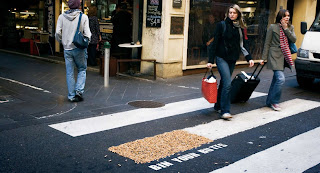
Dont be a Tosser Bin your Butts


'Dont be a Tosser Bin your Butts' campaign was used for the weeks leading up to the Smoking Ban in Victoria OZ. Found this and thought it was a good use of this 'dead space' we all keep talking about. It was to emphasise the ban and the disregarding of there butts. They collected all the butts in a 1km radius from Melbourne centre and then put them on one of the zebra crossings to emphasis there point further. Nothing like a literal approach to problems.

Yoga


While scowering the net i found this piece, i saw the straw idea on Hannahs blogs and it reminded me of that. The clock is for a yoga center in China, but another good piece to emphasise the flexibility and different positions element.

The Simpsons Movie


With all this Simpsonizing around us i thought i would give a review of the movie. I saw this about a week ago and was surprisingly impressed, i had my doubts because as a series i am a fan but that does not always work when they turn it into film, like when the make sequels and prequels, not always good. But it was pretty funny, and when you look at The Simpsons as a animation it is pretty simple nothing is to complex the graphics aren't top of the specification but the script writers are great and at the end of the film you get who did the voices and i never realised how many different characters one person played, could be handy on the hiring front.


On a seperate note a pretty simple and effective poster because we all know that it is Homer's hand reaching for the doughnut and how much of a part the doughnut plays in The Simpsons generally. And like with the the top picture they change the opening scene on the sofa just to add that little extra difference to it every time it starts.

Ping


This is a great brand name, i first discovered it about five yers ago and it related to a thing we had at badminton. But for those who do not know it is a golf brand and an ideal name because when you hit the sweet spot you get a 'ping' and it flies so far and feels effortless, hence the name origin.

Tuesday 14 August 2007

Elle Dunn - Contamination Zone

I first saw Elle Dunn's work in Blueprint, all of her photography is of urban surroundings, exploring derelict buildings and settings. Her type of work has been classed as Urban Exploration or Urbex by many.


I love this first photo, its just so simple and with the black and white, the red sign is emphasised furthermore. When you break it down it really is nothing special, its some amazing view or sunset. But the setup just works, i like old material, like the large school radiators you get and older stuff is just nicer, more effort was put into craftsmanship, and even though they more than likely were not looking at the aesthetics just with age they grow value.


These are just a few of the pictures that i was intrigued by but they are very different. Its nice to see all these buildings and a shame that so many of them are going to waste, with a bit of restoration they could be made back to there formerselves. With the bottom picture you can imagine the productions hat go on there. If any of you have seen the Phantom of the Opera film it's like that in my mind, you see it old but i can imagine the new like it showes you in the film.

http://www.contaminationzone.com

Book Covers

On the we are thoughtful blog they have been designing a few bits and competition pieces and this is one of the covers i came across. Very simple but effective and i wonder why has it not been done before now considering we always say the phrase...

JOB OPPORTUNITY (We are Thoughtful)

Found this on http://thoughtful.squarespace.com/journal/2007/8/7/were-after-a-new-thinker.html
and it is a great opportunity, i would apply but im going to America on the 24th August and placement starts on the 28th. But for people who are looking for placement opportunities this could be a good one. You can find more info and contact details at the address above but to give you a rough idea see below.


So just to recap:

We’d like a student in for 2 days per week
For around 4 weeks
Hours 10am - 4pm
To start Tuesday 28th August

If you’re interested, please email possiblenewthinker@wearethoughtful.com and we can arrange a short interview with you. We’ll be looking to see people’s folders in the week commencing Monday 20th August.

Monday 13 August 2007

Pink Skips


Who would believe it...Pink Skips, the women will love it, well some anyway. A pretty unique way to advertise something so far away from the thoughts of pink, skips and muck and trash. They have consistently run the theme through the skips and tipper lorries, unfortunately not the uniform though, possibly one step to far. But definatley a something unique to make it stand out and be memorable.


Advertising on Wheels

While driving home from Surrey today i have noticed a number of lorries have no advertising on them, an ideal place for someone to advertise there product. The two that stood out were Royal Mails large red lorries, nice clean and shiny, when you compare it to most other lorries on the road it comes out tops until the one and only Eddie Stobart made itself known. Edward Stobart Jnr started to name his lorry cabins after female names, the first being "Twiggy", then "Tammy" (Wynette), "Dolly" (Parton), and "Suzi" (Quatro). With this little novelty factor and the emphasis on keeping all the lorries immaculate and having uniform Eddie Stobart started to get orders from larger firms boosting the business.

To emphasise there success "by the year 2000, it had 1,000 lorries and owned 24 storage depots around the United Kingdom. Since each lorry has a life (before disposal) of three years, this means that the company was roughly purchasing a new lorry every single day".

Friday 10 August 2007

Sign Spinners

My boyfriend recently got back from stateside and told me of this new craze - sign spinning. Check it out.


Im not sure what to make of it, it's pretty impressive that they can do that with the signs but i wonder how much of the actual sign you get to read, becuase it is definately meorable but you lose the viral element if you dont get to read it hence why most ads are still. You could almost do with one person holding the ad and then the other doing the spinning next to him, bizarre either way.

BMW - It's only a car


I think this is a pretty interesting way to advertise a car, because obviously for most of it you dont get to see the car, whereas normally its all about the car. It showes the speed and power of the M5, BMW has already created a sleek image for itself and this just furthers it.

Another ad i found i thought was pretty good too -


As you watch the ad all the things at the beginning could be any car and as it progresses it refines the details to the actual car now, but at the end they almost dumb it down - "it's only a car" as if to say theres loads like this about, but as it says it the BMW grill and logo are left in view when he comments 'it's only a car' and as it goes off it leaves you with 'the
ultimate driving machine', so its ot just a car, its a BMW but to them this is there standard of build.

Tables

Who would of thought table design could be so good, in the sense of how it works, aesthetically there are a lot of nice tables out there, this is not one of them but how it works is nifty, much easier than these fold in the middle ones.


I like how it creates a star as it opens out to slot into its gaps to make it expand. I am surprised that this has not been done before but normally most people go for long rectangle tables i suppose.

Thursday 9 August 2007

Si Scott

I stumbled across Si Scott's work and thought it was great, very simple but unique, it adds more to just type, makes it more interesting. He has done work for the likes of Nike among others. To look at the work is very simple, mainly lines and circles mixed in with some colour but the outcomes are great.


I chose just a couple of my favourites but there are many others, check out more of his work on his site http://www.siscottstudio.com/

Lucas Film Ltd

Being a bit of a Star Wars geek myself i have been looking at the exhibition that is on in London, and spying the Lucas Film Ltd logo i went in search of more info. I googled Lucas Film Ltd. to find http://www.lucasfilm.com/ the opening page is below.


As soon as i saw it i was happily impressed as it is from advanced with regards to there technology used within the films. So it was a surprise to see all of the pictures hand drawn, but some animated. With soem being animated it just adds that bit more from the flat 2d side of it becuase you dont relaie there is any animation and it makes it more fun becuase you go in search for other parts that are animated.

Neutelings Riedijk

I found this firm becuase i was interested in the Central Tax Office in the Netherlands -

The whole building has the dragns all over it, the reasoning behind the dragons is based on fairy tales - "the dragon protects the treasure of gold bars and jewels." I find it funny for that a serious concept they took this concept, becuase it looks very bizarre to hae these dragons all over the buildings. The water is there for ecological (cooling the building and collecting rain water for toilet flushing) and security purposes (deters intuders) but also viually adds something to the overall build.

Some of the other works they have done vary alot and are not your normal build by any means, below is a Printshop in Amsterdam


They are not scarred to try different things and the best bit is neither are there customers which helps people to be more creative and experimental. Another building that caught my eye is the Netherlands Institute For Sound And Vision, some of the building is below as well as above ground and the the coloured glass 'depicts famous images of Dutch television'.


Check out http://www.neutelings-riedijk.com/index.php for some more wierd and wonderful designs.