The latest Creative Review is a logo special, some of the winners are expected, Nike, Apple for instance but one of the logos that stood out the most is the Mother & Child logo designed back in 1965 by Herb Lubalin. This was originally designed for a magazine which never got published which is such a shame. The logo is pretty self explanatory, its simple and cleverly uses the type to create an image.
A couple of other designs by Lubalin follow a similar theme of being family orientated; again simplicity rules for maximum impact.
Wednesday, 30 March 2011
Tuesday, 29 March 2011
Perfection?
If you are involved in design in any way shape or form you will analyse and judge everything you see, it's natural. Would you have used that layout, chosen a different colour or expressed your message with that typeface? Today I treated Percy (my car) to a Mini Valet in a nearby village and while the staff washed away I was looking at there handmade signs informing of prices and services. There is something quite satisfying about seeing a homemade sign. It has not been scrutinised from every angle, looking at the leading, alignment and positioning. It is more than likely that they looked at what materials they had, who had the most legible writing and what tins of paint they had knocking around. The funniest thing is that we could spend hours trying to create a look as simple as this. It did make me a smile that you could see rubbed out ruler lines used to help make the copy look as neat as possible given the tools available.
* Two other things, firstly the Mini Valet at £10 is amazing, my car looks brand new. Secondly why does it always happen to rain when I have finally got round to washing the car?
A little mistake...
It always seems to be the simplest of things that you never pick up on. I am currently working on some clothing packaging at work. I popped into the warehouse to cross reference a few other product lines and spotted a little mistake which actually could be classed as quite a big mistake. On the reverse of the clear plastic packaging is the mandatory warning notice about being in reach of babies and children with potential suffocation issues. The major error comes with the spelling of children, an O is in the place of a C, bearing in mind this is on the reverse of a range of packaging that is potentially distributed worldwide. The thing that baffles me is that the O is nowhere near the C on the keyboard, printer error maybe...
I can confidently say there is no Ohildren in my work. This has shown me how important checks and proofs are to making sure the final piece is immaculate.
Monday, 28 March 2011
Keanah - Ted Baker
The said shoes in question from the previous post are the Keanah peep toe stiletto, divine indeed! On the shelf - a little more than your average shoe; with some legs attached to them - amazing, elegant! The shoes with the dress, beautiful, they are light on the eye with thin heels, gold inners/soles and ornate bows. I love the bow, it is like something you would find on a present and its not a run of the mill bow that you find in the majority of high street stores. The other thing about these shoes is the packaging, it has the usual tissue and box but in each bow loop is a polystyrene cylinder to keep the bows perfect form during transportation and storage - genius.
Sunday, 27 March 2011
Teddy Baker
In the middle of a crazy busy weekend, I popped over to Birmingham for a cheeky shop, second stop Ted Baker. A friend of mine was on the dress hunt for an awards dinner. I have to say I love Ted Baker. Firstly great clothes, and the shop design is a mix of old and new - fabulous wooden floors, some old style lamp shades that had been revamped to bring them more up to date, hung at different levels and used as a corner piece. They have used a combination of metal and wood. I particularly liked some of the clothing rails and the stair rail which reminded me of the style of what my mum would call old hospital beds; almost a bit drain pipe-esque but thinner, not too chunky or weak but blends well in the setting. The other thing that I really like is how they showcase their pieces which is obviously part and parcel of being a high end high street retailer. Each rack is a different design to the next and features a few pieces so you can actually look at the clothing and not get bombarded by a mass of material clumped together. After a scout around a few bits, we were taken to the changing room and our clothes carried for us (why thank you kind sales assistant). They have large changing rooms but more importantly they have a wide corridor between the rooms, creating an in-house catwalk with a huge mirror at one end so you can have a good look at yourself. One thing which I thought was truly amazing is that when my friend was teetering around on her toes pretending she was in her heels the upstairs sales assistant offered her some shoes to help finish off the look. I thought this was great, firstly it helps you get a good look at the dress and how you will potentially look but it also draws your attention to some fabulous shoes they were selling which before we had merely glanced at and were now falling in love with. A great way to subtly make an extra sale without hassling the customer but merely providing a service.
Tuesday, 22 March 2011
Diet Coke
I have only seen this advert once and I quite like it but at the same time I feel there is something missing. It reminded me a bit of the innocent smoothie ad although technically this concept was more relevant to diet coke being the 'lighter' option, hence the puppets. Again good song choice, I think the issue I have is that a pile of work is an easy task to fix - you invest time to reduce it, maybe it should be something a bit more challenging that makes you laugh a bit more.
One of the funniest things is that I was flicking through an old Marketing Week magazine and I read an article by Steve Hastings about Innocent's cheeky smoothie ad. At the end of the article he said that Coca Cola would never make an ad like this and that it couldn't joke and have all the good tunes. Bizarrely,a day or so after reading that article I saw the coke advert, did he know something we didn't? I think Coca Cola have used a pretty good tune but if were being honest nothing will ever beat the original diet coke break commercial with the Etta James 'I just wanna make love to you' tune and the hunk drinking from the can.
Sunday, 13 March 2011
Elle MacPherson Intimates
This is a bit old, it was made for the New York Fashion Week in 2007 but I have a feeling that things like this will be appearing in front of us even more. For example we have seen Adidas introduce the AdiVerse wall and with brands fighting for our attention your average shop front may not remain the same for weeks on end if it goes digital. One key element would be the potential to change what is on the screen daily from new garments to offers tailored to each store.
This is a great example of what fun you can have with technology and your prospective audience. You will always have a core audience but this display allows yo to interact with people that would possibly not be interested in your brand previous to this. This concept ties in greatly with Elle MacPherson Intimates as your are uncovering the lingerie, seeing beneath the clothes so to speak. Underneath you reveal models in said underwear, lounging around - a video on loop and depending which area you uncover depends what you see (bit like the old catchphrase...). An interesting factor is that there are still some people who seem quite oblivious to what their presence does to the screens, nevertheless an impressive development in technology that makes the field wide open for possibilities.
Saturday, 12 March 2011
Dyson
Over recent years men have become more favorable to shopping, looking after their image an choosing wisely were they spend there money. I think this has partly come round because of David Beckham and how Victoria groomed him, it became fashionable to look after yourself. The other thing is men aren't so willing to shop for hours on end - scouring every rail for that ideal top, they also need it to match a level of functionality. Even so many brands still direct many of their adverts at women, segregating the men who you could argue technically have more money to spend, not as frivolous and usually earn more than their counterparts.
One brand that seems to have nailed this is Dyson. Typically you could say hoovers and washing machines, 'white goods' are aimed at women but Dyson sells its products on it's engineering credentials which have the appeal to the men. On top of this the design mixes hard lines with curves, deep steely greys and bright bold colours to soften the overall look and bring it to life. All of Dyson's adverts are about the product and the technology behind it making it gender neutral. My mum swears by her Miele but I have to say I would tempted to buy a Dyson if it was for me - the style, design and the brand. I also quite like the satisfaction of seeing what you have cleaned up, the transparent cylinders show off all the dirt. My brother moved out a year or so ago and he bought a Dyson for his pad. If I remember correctly it has fuschia coloured components but it doesn't matter. It's a Dyson and that is the model he wanted, he bought it for the technicals not the colours.
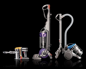
While we are discussing Dyson, they have continued to expand into similar areas of the market. In the hoover range it has developed into cordless hoovers and even made a hoover specifically for grooming your pets, you literally hoover your dog, get the loose hairs before they are all over your carpet and furniture. Ingenius.
I particularly like the Dyson Airblade, also known as a hand dryer. You actually feel like your hands are being dryed and on top of this, when visiting the website, their Airblade page has got short sharp facts of which you can choose to delve into further. Take a peek, well setup and designed with consistency running through their marketing and advertising of their products.
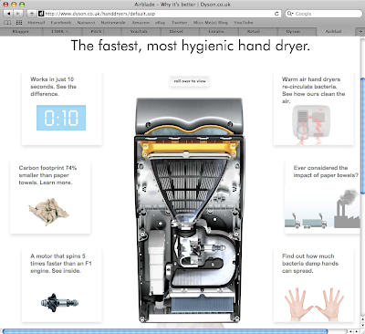
As I ventured further into the world of Dyson. I found they also did fans, obviously not your average fan. This is Dyson were talking about.
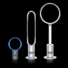
These fans look like they are out of Futurama - pretty space age. By far, one of the best features is the lack of blades for those little hands to get caught in, which in turn, makes it easier to clean, as it is just a hollow circle. Fascinating how this can generate a breeze when there seems to be nothing there! Obviously, it does come with the Dyson price tag - starting from £199.99 and rising.
As with everything it comes down to what your willing to pay and generally the more you pay, the better the quality. Dyson not only knows how to attract an audience, it can hold their attention. Definitely an exciting brand for the future.
Friday, 11 March 2011
Honda Jazz
I think Honda has some fabulous adverts, the ideas and the animation - fabulous! Their latest commercial to add to the collection - the Honda Jazz. The advert reminded me of many other commercials. For instance, the clouds remind me of some of the Guinness ads that zoom out to be the pouring of the pint, the animated characters I think of Llyods banking, animals popping up from below the clouds and I was thinking of Harry Potter and the patronesses' they create... Bizarre I know. The quality and the ideas - great, it flows from one part of the story to the next, it just doesn't have the pulling power of the other adverts whether it's the Honda choir or the 'Hate Something' campaign.
Not quite 'all that jazz' but I have to say I love the giant baby heads, something about them and the use of colours... They would make a great ballon for hot air balloning, could be a fun entrant from the car brand.
AdiVerse
I cant make my mind up about this, I think that as long as it is used purely for showcasing pieces from around the world or that are only available online is fine but I hope some stores don't replace it with the real thing. It kind of ties in with the whole internet shop vs literal shopping itself, obviously the online price is desirable but you cant beat that feeling of walking out of a shop with a purchase you love.
So Adidas and Intel have teamed up to create such a wall, up to 8,000 shoes where you can rotate, zoom etc and see peoples comments via twitter and such social networks. For Adidas its about extending the current range available to customers.
One of the other things I find fascinating is how it can recognise the gender of the individual approaching. This system also has the option of finding out a more detailed information about the shoe than many shop assistants would potentially be able to offer. To add to this there is marketing material available to view along with stats for all those sports fanatics out there. The final payment element is becoming very similar to what you find in Apple stores, people with iPads/tablets where you don't have to go to an actual till point you can purchase your item literally in the middle of the shop. Interesting developments in the world of retail.
Monday, 7 March 2011
Reverse Graffiti
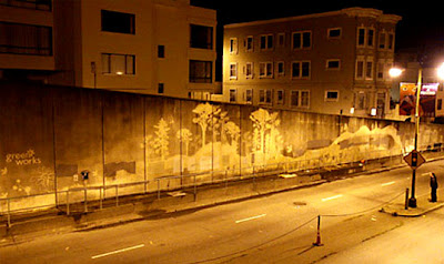
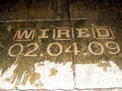
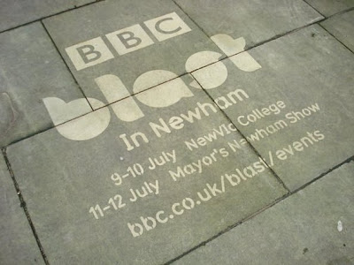
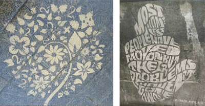
Sounds impossible right? Wrong. It's all about taking dirty walls and basically cleaning them, a bit like when people write clean me on a dirty van. This mainly comes from a guy called 'Moose' also known as Paul Curtis from Leeds. Moose takes the dirt away and in the way he does it he forms new shapes and lines creating pieces of art. I think it's a great concept, your not defacing anything and you making use out of the space.
One of the things I love about the San Francisco Broadway Tunnel is not only the use of empty surfaces but the contrast of the concrete which has the tree's etched into it which is the complete opposite making you think of nice open spaces and clean air. As you will have seen the concept works around using stencils to create images from the dirt which is blasted away. A pretty innovative idea and some major companies from Starbucks to the Police have used the medium for advertising, as we know things that are out of the ordinary stand out more and become a talking point.
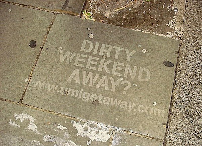
I find the one by the police slightly hilarious, pretty out there for them. It is a good opportunity however for companies in that line of work for ex. a cleaning services company or for a business to somehow incorporate it into there strategy, for instance 'dirty weekend away' (below).
One of the other ones is by crisis and relates to homeless people, the other half is just another creation.
Keep your eyes peeled everyone.
Sunday, 6 March 2011
iPad take two
We all knew the inevitable was coming sooner or later, the iPad 2 has been launched already, probably no more than a year or so after the original was released. So as technology usually goes the product gets lighter and smaller while the capabilities memory and power get bigger.
Looking at the images of the new iPad it seems to have similarities with the MacBook Air, more rounded and no doubt lighter. One of the new features is two web cams so you can face time. Our household has an iPad and while the features will be great for some people, my mum is pretty content with just surfing the web for new handbags.
The other fabulous side of this coin is the opportunity it has brought for advertisers. The tablet has made it so you have access to the web at your fingertips. For instance if you read magazines or papers online, firstly the iPad is a great tablet to do so with its small and lightweight form. Easy to take it anywhere and a great size, it makes it ideal to read from and from the advertisers perspective they must be laughing as all the adverts they will have featured normally in a print out magazine will now be in web form and you will be able to click directly on the link to take you to the desired location driving more customers and potentially revenue to said company.
One Coffee Shop in Croatia has got rid of it's newspapers and moved forward using iPads in a bid to be greener and keep its coffee drinkers on the pulse with up to date information.
Endless opportunities and usage, the world is Apple's oyster.
Nice Knokkers...
Knokkers is a cross between pool, ten pin bowling and I would say bowls too from the looks of things. The pitch/table is two buses long and you play it pretty much like pool but instead of the cue you use the 'knokker' (cue ball) to aim for the balls. Pretty random but supposed to be a big hit currently in the UK, USA and China, the table costing a mere £25,000 so cant see them popping up everywhere just yet.
The big boys go eco...
So I'm a tad behind on some of my posts so for some of you it may be old news... my apologies. One of the things I saw last week in the Metro was about Porsche unveiling there new Panamera S Hybrid eco car. This post is more about the show than the release of the car. Although I think all manufacturers see it is a necessity that they start to develop there range to incorporate eco cars as even the likes of Rolls Royce introduced a an electric Phantom. Anyway back to the show. Porsche unveiled the it's new Panamera S Hybrid by bringing out the Semper Vivus one of the first hybrid cars from 111 years ago, followed by acrobats who made up the the car, this part was pretty amazing, so they have a few props to help them out, on the visuals such as bumpers and wheels, and the rest is done with there bodies and the lighting to make it look like the car is there and is then driven in, a nice show piece to help with the launch and PR side of things.
Sim China
With China's strict control over what it's population can and cant see google maps is one of the big things they regulate. Baidu Maps has created a portal which looks exactly like google maps and the maps themselves for certain cities take on 'Sim City' form, the only way around the tight restrictions.
Thursday, 3 March 2011
Wills and Kate
As soon as the Royal Wedding was announced I am sure various people were rubbing there hands together rather smuggly, oh the opportunities for memorabilia. In this day and age it's not just based around your usual china plates and coins, I have found a few things to make me chuckle.
So if your already sick of all the hype...
Just three pounds a pop...or you can just lie back and think of England with these Crown Jewels condoms -
One of my favourites is these tea bags -
Obviously the whole british thing with tea for starters, but I just think it's a hilarious idea to have the queen join you, all you need now is cucumber sandwiches with the crusts cut off and that is high tea folks.
BT Vision
BT Vision is actually a digital TV service that BT offer however i also think it applies to there current advertising campaign. I think it is a popular campaign among many households, simple, a nice family featuring Kris Marshall also seen in My Family and Love Actually. The campaign has developed over time and the viewers have watched and in 2010 helped decide how the plot develops. It all started in 2006 when using a stereotypically unconventional family Adam aka Kris Marshall meets Jane's two kids and there starts the plot. Overtime we get to see how they deal with buying a new house, thinking about a child together, the biological father coming back on the scene, engagements, dream jobs etc. life's crossroads that many of us will hit one way or another. So currently Jane is pregnant and they are planning the wedding, or more to the point we, the public, are planning the wedding. This is the point I am getting to, not only have BT managed to make one idea a six year campaign but it has evolved as the story-line has progressed, the public has grown and kept an interest as to what actually happens to the family. Cleverly they have incorporated the public to help with the story-line technically making there work a lot easier, they think of an idea, let the public decide which way to go and they implement the chosen plot, but it also means the general public get to see the outcome they want they just have to wait for the physical evidence. Currently you can help decide the wedding scenario, choosing what dress jane wears and potentially starring in the advert. A little summary below that makes me smile with some classic moments like Jane spitting wine everywhere, but a typical reaction. bT have also got a section on there site to do with the BT Family and you can log onto http://www.facebook.com/BTUK to help plan the wedding. From a word of mouth point of view BT have made it so you have to 'Like' the page before viewing any information to do with the wedding resulting in being featured on a number of peoples walls spreading the word in potentially one of the quickest ways nowadays, Facebook.
Tuesday, 1 March 2011
Anyone got a spare plectrum...
One of the great things about seeing this online is you get to appreciate the image even more, I originally saw this in the Metro and what is actually the Fender logo on all the plectrums just looks like a grain of the paper when printed on news material and secondly the colours are brought to life.
The Jimi Hendrix mural is made up of 5,000 Fender plectrums, the piece has been selected to be sold at a music memorabilia auction to raise money for Cancer Research UK, the piece is expected to fetch between £12,000 and £16,000. The style used for the portrait is complimentary to Hendrix's reputation and one of the great guitar companies, a pretty fitting tribute one thinks.
It's in similar essence to what I said before about Andrew Meyers who made portraits from screws and hand painting them, like this it's great if you can apply it to something, the follow through. So looking at the Hendrix 'picks', made out of guitar plectrums, Hendrix famous for his guitar playing skills and now been sold at a music orientated auction, bam! But again it's something that could be a great asset to a store or cafe/ bar, either by having that relation in a music store or simply because he is an icon and this would be a great focal point or piece of art.
Daytime TV & ad breaks
Some television programs are on in the middle of the day for a reason, this afternoon I crashed out on the sofa to watch House Gift with my mum, which I have to say I quite enjoy. During the advert break we both had a giggle and noted how we liked two of the adverts that come on -
The Dating Direct Advert is not quite the one currently being screened, but supposedly the video has been on here since 2008 but I have never seen the advert until recently so...
Both adverts are quite different in respects of what they are selling but a similar style of humour is used across the board. We all know commercials are about selling, but it's how you do it, these adverts have provided us with amusement while using a situation that people could easily associate to and obviously signing off with the brand. Other brands like Mr Muscle for instance is purely about selling the product, there is not necessarily any embarrassing scenarios and its a product that we don't necessarily want to spend money on but have to. Either way I was quite happy that a couple of adverts had made me smile, even though I know what was going to happen. However this did get me thinking about the recent change brought about by Ofcom, which will see an increase of seven minute of adverts to potentially up to 12 minutes during films and single dramas, that's nearly a 100% increase on ad time.
The idea is on a 12 month trial but it was also launched the same day as product placement is being introduced into British TV. This means on a range of programs minus ones like the news and children's shows you will see more brands, so next year you could see Cheryl Cole with a can of Coke Zero as she's judging the contestants... Don't get me wrong I enjoy adverts for the creative side and obviously if it attracts my attention like these two, but if were being honest we like having a few minutes break so we can nip to the bathroom, pop the kettle on, grab a biscuit and be seated ready for the second half without missing any of the show. I suppose we will have to see how it goes and complain either way as 12 minutes of adverts seems slightly excessive, I could be in bed those five minutes earlier without those breaks.
Roll up, Roll up, room at the Circus!
Subscribe to:
Posts (Atom)